ResearchNeeds.org
Connecting researchers with local science needs
Problem: There is a communication gap between NGOs and student-researchers. Often, student-researchers’ projects are never implemented. At the same time, NGOs find it challenging to find skilled researchers to meet their research needs. Our client’s website, ResearchNeeds.org addresses this communication gap by helping NGOs to recruit student-researchers and helping student-researchers to apply for NGOs' research projects. The website was in its beta version at the start of our project and had not yet had a usability evaluation. Additionally, its concept had not been formally validated.
Goal: The client wanted us to perform a usability evaluation of ResearchNeeds.org, provide recommendations for design changes, and validate that the site was useful to its target audience (student-researchers and members of NGOs who are responsible for recruiting external researchers).
Project Duration: 4 months
Team: 4 members
Role: I guided my team's research and design strategy, educated my team members about UX techniques, was responsible for asynchronous communication with the client and research participants, and performed my share of the research and design work.
Tools: Figma
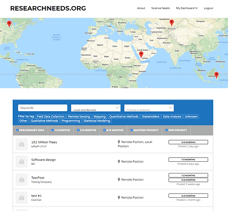
ResearchNeeds.org's landing page

Process
As the member on the team with the most experience in UX, I had a significant impact in determining the timeline and strategy for the project.
User Interviews
To determine whether ResearchNeeds.org was useful to its target audience, we conducted user interviews. Due to the fact that student-researchers and users from NGOs have different needs, we interviewed 6 student-researcher participants and 4 NGO-participants. For interviews with the student-researchers, the semi-structured user interview script was written to elicit information about interviewees' needs and challenges in finding research projects. For interviews with the NGO-participants, the script was written to elicit information about their needs and challenges in fulling their organization’s research demands (through external recruitment or otherwise).
We gained several interesting insights from our interviews:
-
Networking is difficult, time-consuming, and repetitive for student-researchers
-
Student-researchers need help finding positions that fit their interests and career needs
-
NGOs need help finding skilled candidates
ResearchNeeds.com in its current version offered solutions to all of these issues, thus its usefulness was validated, without need for pivoting.
User Tests
We then performed user tests to explore the challenges that target users had in using ResearchNeeds.org. We gave student-researchers tasks in which they looked for and applied for research opportunities. We gave NGO-participants tasks in which they posted research opportunities and accepted applicants. We tested 5 student-researcher participants and 5 NGO-participants. We found 34 usability issues, for which we offered recommendations for design changes.
Wireframes
Medium-fidelity wireframes were created to illustrate the recommended design changes. Due to project time constraints, the wireframes omitted parts of the original pages that were not relevant to illustrating the corresponding design changes. This was not an issue for the client, who believed that, despite the omissions, the wireframes would serve as sufficient guides to the developers, for implementing our recommended changes.
Design Recommendations
As it would be unwieldy to present all design recommendations that we offered on the present page, recommendations for 3 screens of ResearchNeeds.org are presented here. The wireframes depicting these recommendations, and the screenshots of the corresponding original pages are shown as well.
Registration Page
Allows users to create an account on ResearchNeeds.org.
-
Issue: Participants had trouble accessing the Terms and Conditions agreement- it wasn't clear that "Terms and conditions" is clickable.
-
Recommendation: Underline "Terms & Conditions" and make the font color blue so that it clearly looks like a hyperlink.
-
Issue: The website does not clearly give password requirements until the user attempts to input a password that fails to meet the requirements. The hover-over question mark in the current design appears to be insufficient for letting users know about the password requirements in their first attempt.
-
Recommendation: Show password requirements in a small font size above the password section.
-
Issue: There is no "Undergraduate Student" option for specifying the account type.
-
Recommendation: Under the “account type” section, offer users the option to sign up as a "Researcher" or “Recruiter”, instead of the current options.
Original version (click to expand)
-page-001.jpg)
Wireframe (click to expand)
%20(1)-page-001.jpg)
Research Opportunities Search Page
Allows student-researchers to search for research opportunities that have been posted by NGO-users.
-
Issue: It is confusing that there is no button to press to start a search after keywords have been entered.
-
Recommendation: Have a "Search" button to press under or near the keywords box.
-
Issue: It is unclear how to use the keywords section. People are confused by the clutter of search features.
-
Recommendation: Declutter the search bar so that only a keywords search field, location search field, and categories search field are shown by default. Add a toggleable advanced search box, with additional search features including multiple selection fields for duration, project type, and position.
Original version (click to expand)

Wireframe, untoggled state (click to expand)
%20(2)-page-001.jpg)
Wireframe, toggled state (click to expand)
%20(3)-page-001%20(1)_jp.jpg)
View of Individual Job Application on Dashboard
NGO-users can view applications that student-researchers have submitted for their research opportunity postings.
-
Issue: In the box for a particular applicant, the function of the buttons (located under the stars) is unclear.
-
Recommendation: Make the icons bigger and give them a text label according to their purpose. Alternatively, give the buttons icons that are more indicative of their function.
-
Issue: Users had difficulty knowing how to send an email to the applicant.
-
Recommendation: Make the applicant's email readily visible by displaying it in the applicant box.
Original version (click to expand)

Wireframe (click to expand)
%20(11)-page-001.jpg)
Next Steps
We gave the client a comprehensive report, which summarized our research and elaborated on all of our design recommendations and their rationale. The client was pleased with the deliverables and indicated that the recommendations would inform the final development of ResearchNeeds.org.
Click here to read the comprehensive report on this project.